Southwings
BRAND STRATEGY
WEB DESIGN
WEB DEVELOPMENT
LOGO DESIGN
SouthWings partners with conservation groups, community groups, media, and decision-makers to provide a unique perspective to better understand and solve pressing environmental issues in the US Southeast. An extensive cadre of volunteer pilots act as guides, educators, and entertainers for these distinguished guests, and the Southwings organization relentlessly matches guest needs with place-based issues and pilots in the right places at the right times.
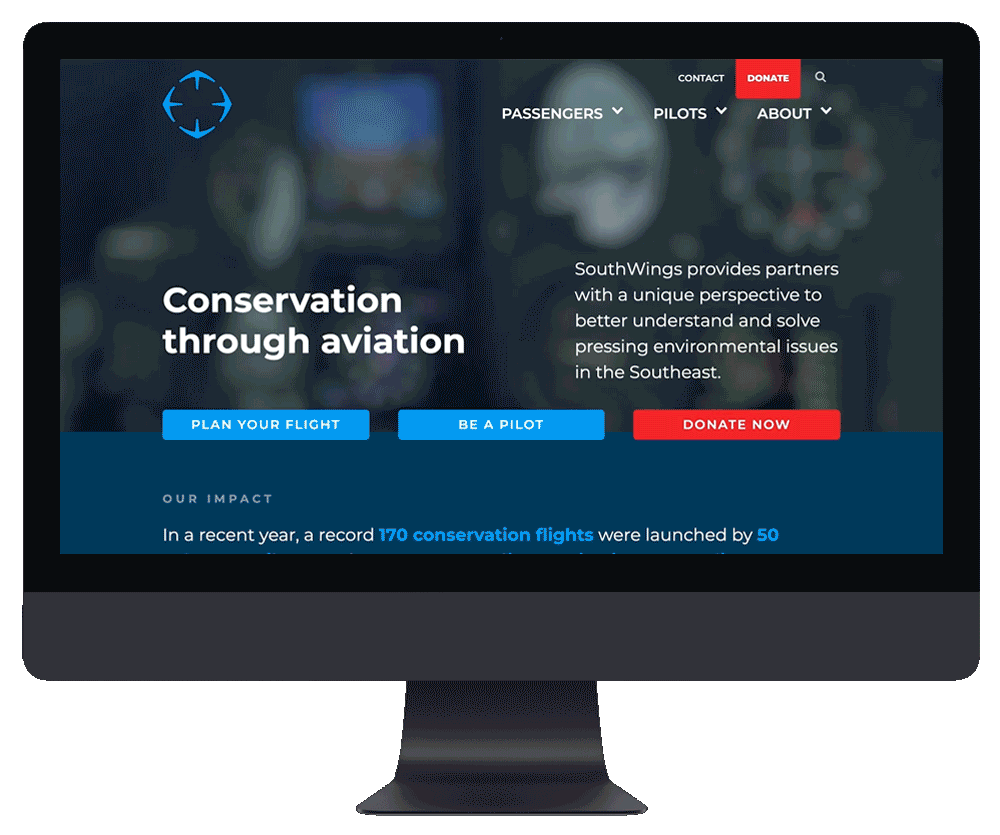
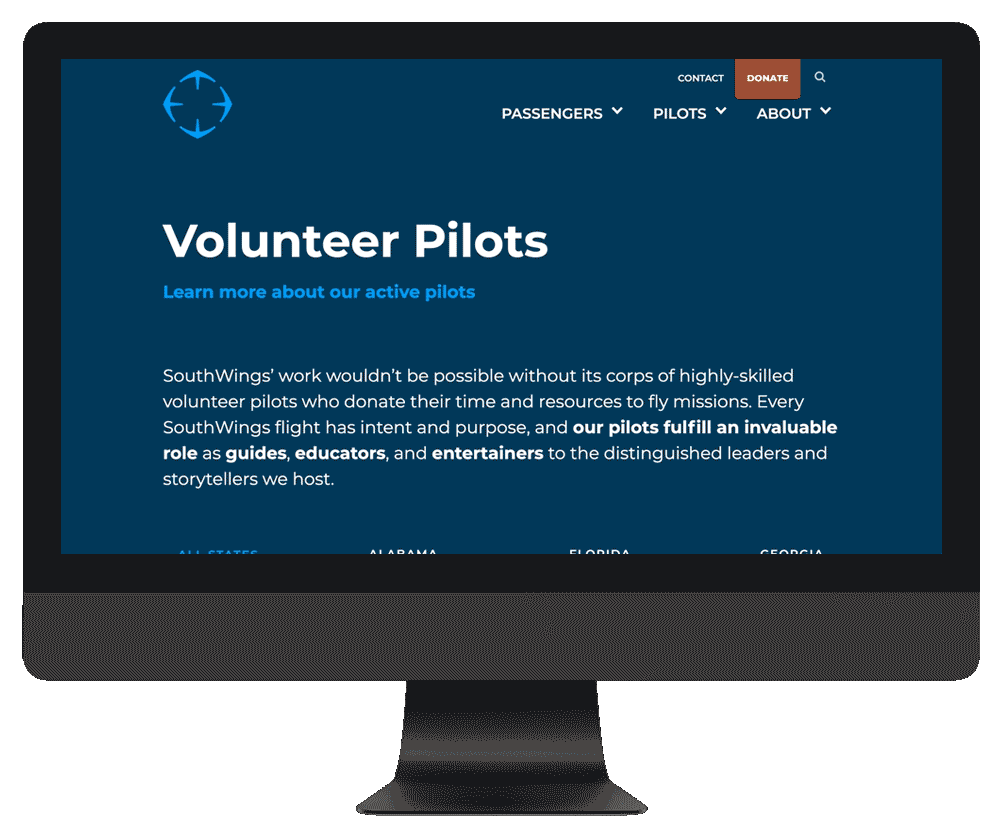
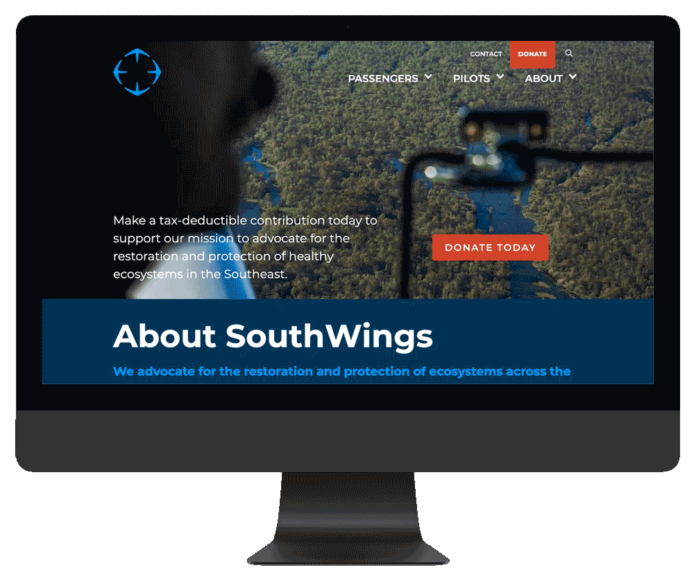
I first overhauled SouthWings’ web presence in 2011-12, and after seven years the stack and design were showing their age. So in 2019-20 we went at it again, re-imagining their brochure site from the ground up. One thing that remained valid from my previous brand strategy work with them: we knew we’d need to appeal to the needs and desires of three distinct user groups: guests, pilots, and funders. By drastically cutting down on the number of pages and quantity of content the previous site had grown to accomodate, a new site architecture quickly funnels these groups into appropriate journeys. Refreshed style guidelines are set to inform SouthWings’ entire suite of digital collateral. For the CMS and hosting platform, we chose to move from Wordpress to Webflow for ease of content management and development.
Tools: Webflow, CSS, JS, Illustrator, Photoshop, Sketch
Tools: Webflow, CSS, JS, Illustrator, Photoshop, Sketch
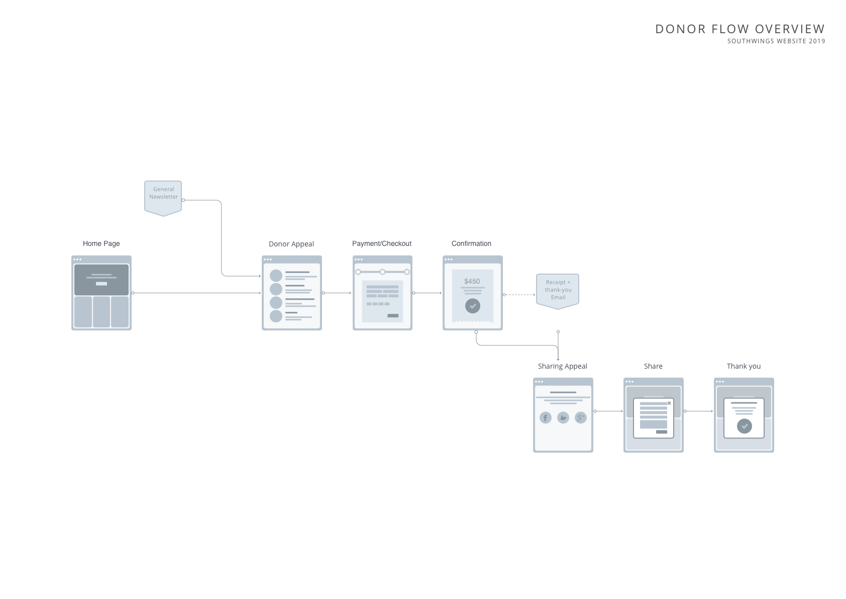
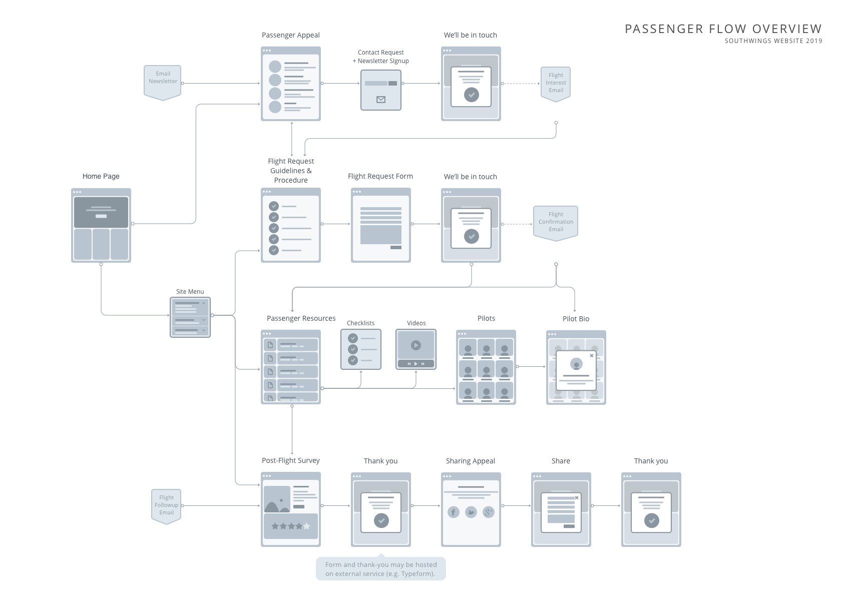
Initial user flows:


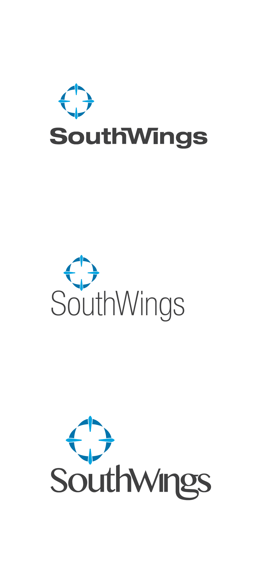
In addition to designing and developing a new responsive CMS-based website from the ground up, I crafted a new logo and visual brand language.
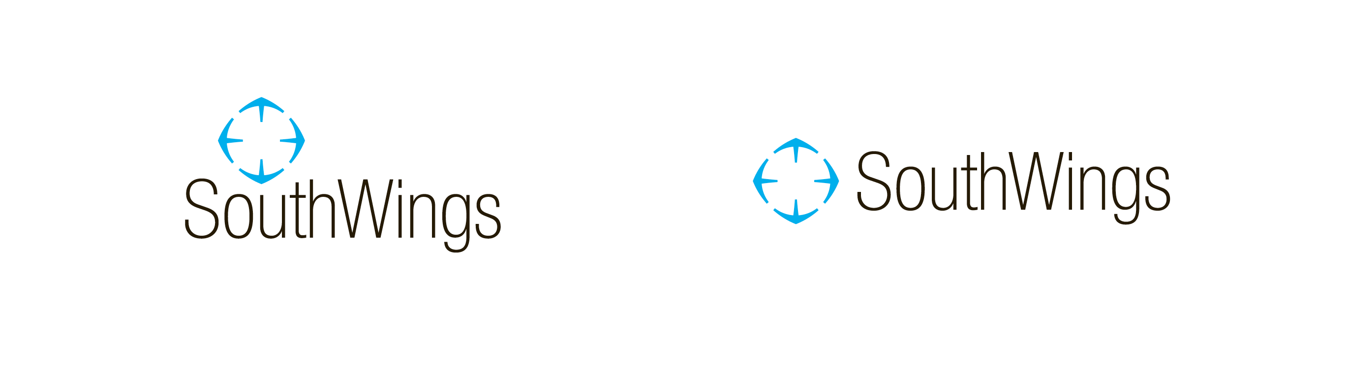
Though Southwings’ existing logo was showing its signs of age, it had a good story and quite a bit of love invested into it. I worked closely with their team to understand what factors led people to resonate with this existing brand and then craft a modernized and web-friendly update that continued the legacy.
Tools: Illustrator, Hand sketching
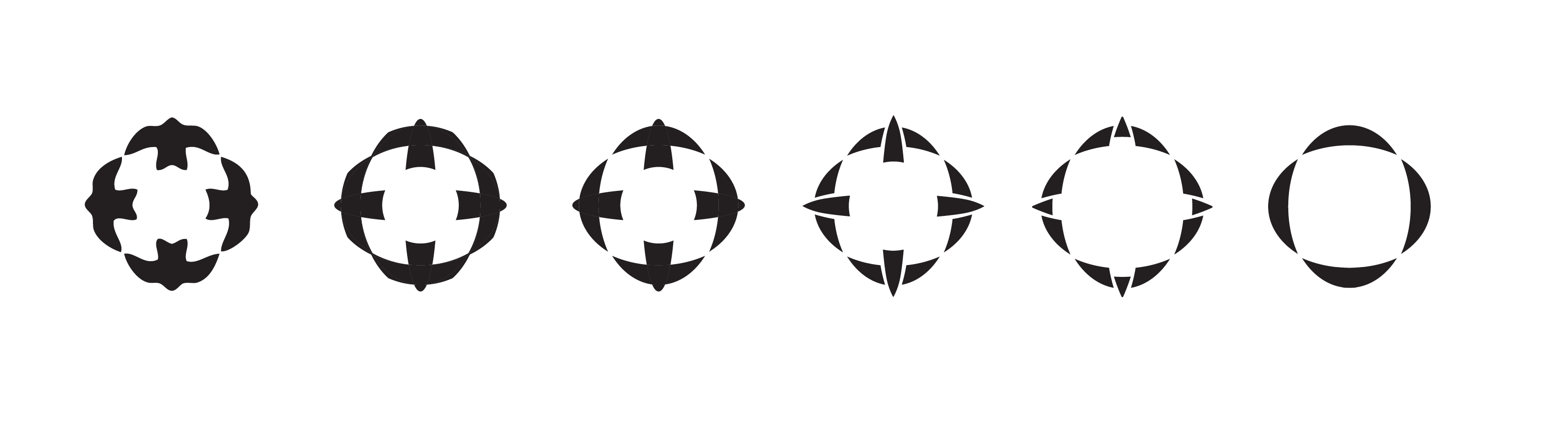


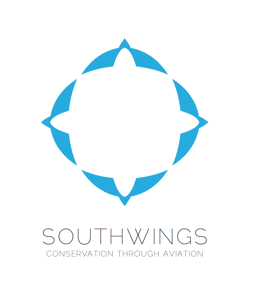

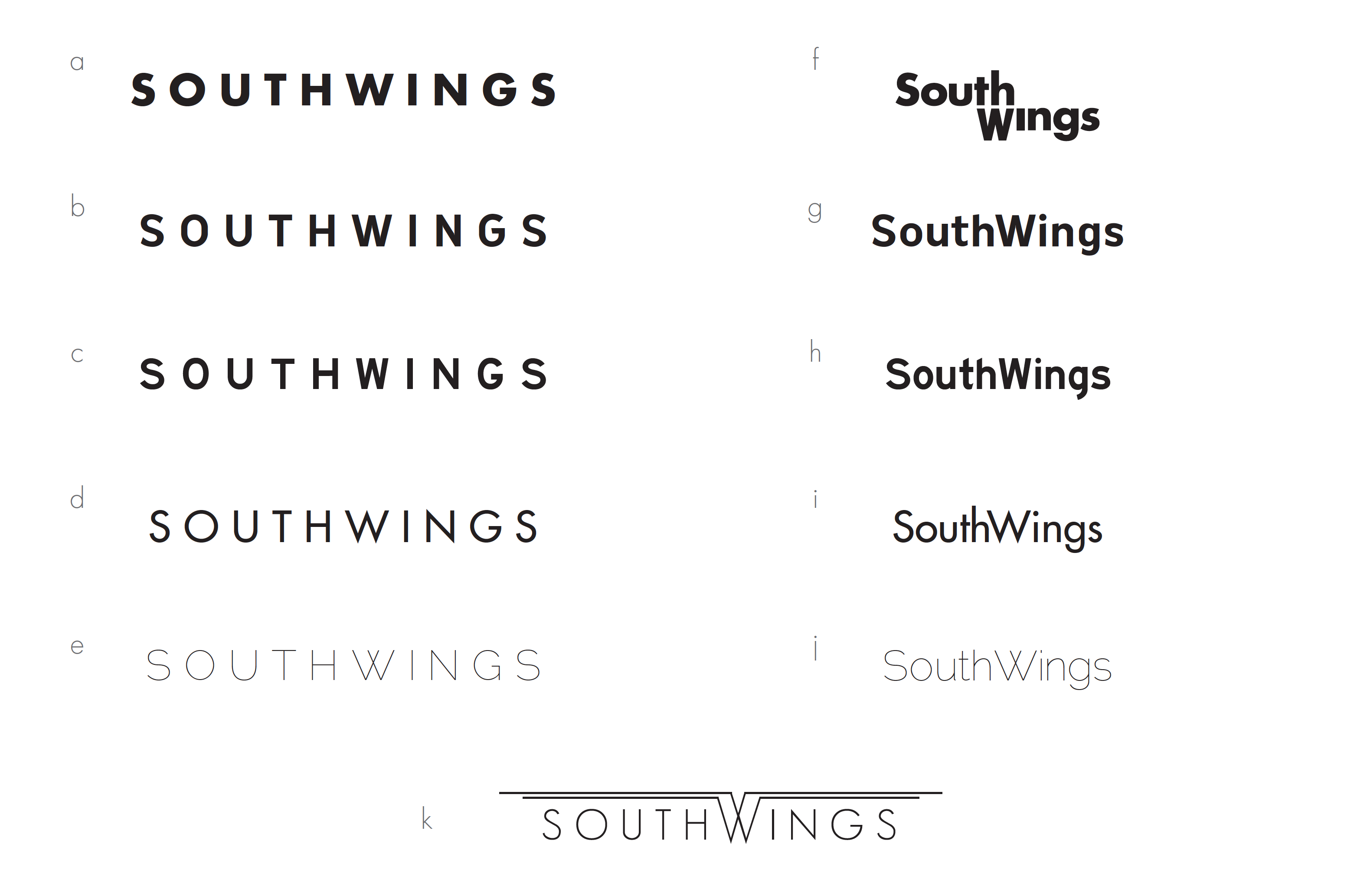


I initially abstracted the existing logo into two overlapping ellipses and then built up a round of swift and swallow-inspired options based on those. Although I was enthusiastic about several of the directions, I learned a valuable lesson on this project. After several rounds of iterations, the Southwings team wound up choosing to go with a logomark direction that I had initially presented for the sake of breadth, but wasn’t all that fond of. Despite hours of tweaking, poking, and prodding, I just couldn’t quite balance thick and thin, linear and curve, positive and negative. The proportions were just ... off.
As an experiment I went back to one of the birds I initially looked to for inspiration on this, the chimney swift, and did a few form studies that more closely mimic its silhouette:
As an experiment I went back to one of the birds I initially looked to for inspiration on this, the chimney swift, and did a few form studies that more closely mimic its silhouette:

While these forms brought more thin and gracious forms onto the scene, there were a few fatal flaws: I wasn't a huge fan of the clover/flower shape that was formed in the negative space, the swift forms looked kind of like a circle of people joining hands from above (although the metaphor is kind of nice, it seemed a little too "Kumbaya"), and the organic nature of the lines – especially around the head – were distracting. SouthWings' clarified mission and goal of partnering with business and political big-wigs continually brought me back to the need for a similarly clarified and confident logo built from simple, geometric forms.
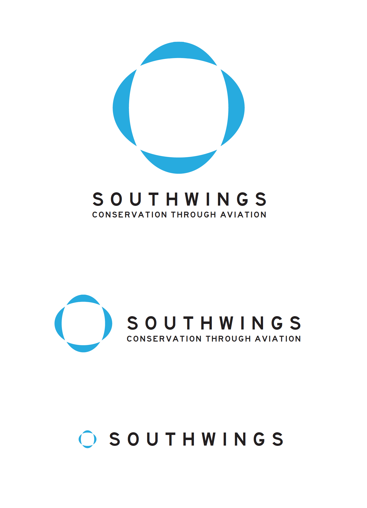
Taking all these factors into account, I translated these symbolic swift studies into abstract geometry, just as I’d done initially with the original logo. The result checked off all the boxes on Southwings’ end and my own, and eventually became the final logomark: